Saturday, July 30, 2011
Saturday, July 16, 2011
happy mid summer
I gasped when I saw how long it's been since I last posted. Seems like I missed the whole month of June. Not sure how that happened, but I am spending a lot of time in the studio preparing for fall shows. The show I'm curating that opens in September has been the focus of my attention. As has having my work commissioned. Oh yeah, and running a private psychotherapy practice takes a bit of time too. No excuses though. Just prioritizing. Or triaging.
Since the damned deer have devoured the profusion of morning glories I was planning to shoot and post, I have chosen to use these imaginary flowers instead. Here's a bit of summer for all y'all...

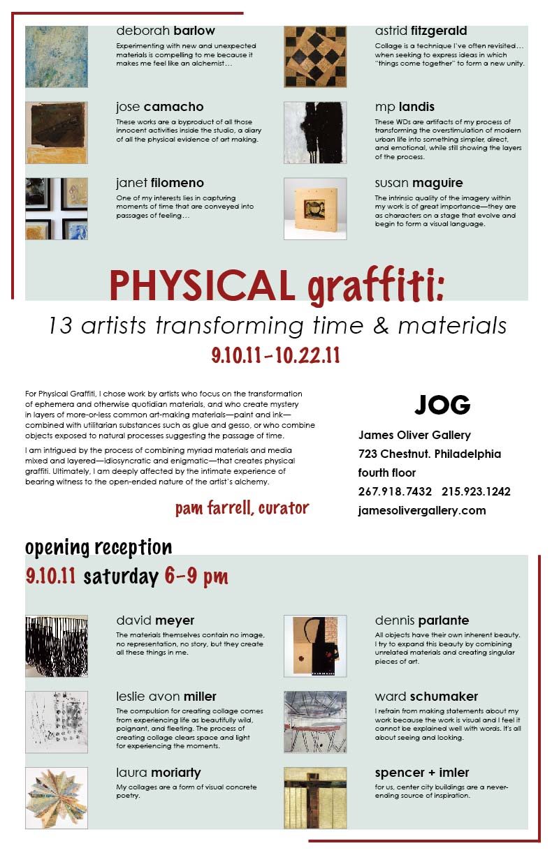
The publicity materials for Physical Graffiti, the show I'm curating, are nearly completed, and in another few weeks I'll be posting info. For now, I can say the process has been fun, challenging, complicated, fulfilling, and working with some very talented artists has been truly enjoyable. Please check back for more info... and save the date:

Friday, May 13, 2011
mixing it up

From the Suspension Series (scrim)
pigment-based ink on silk, mylar, wax, found wood
2010/11 appr. 16 x 16"
After being away from wax for a couple of years and working in oil, I've spent the past few months easing my way back. Having also spent a considerable period of time working on digital photo-based images, as well as creating a large body of work of oil on mulberry paper, I wasn't ready to walk away from paper just yet.
I gave myself some freedom to experiment with numerous materials I hadn't used with wax before: pigment-based ink on silk, Duralar (mylar), corrugated translucent plastic, and double mulberry paper, encaustic medium and paint; pigment stick, powdered pigment, mica, and other powdered materials, graphite, and found wood.
In all cases, I was after light...capturing it, directing it, allowing it. This does not translate much in these photos, but is very apparent in person. Something to work on--how to photograph the work to more accurately show the play of light through the wax and other translucent and semi-transparent materials.
Most remain untitled, for the moment at least, with the two digital images printed on silk coming from a series that has been around for awhile. All of these works are of various sizes, and the smaller ones I think of as maquettes, sort of, but may make their way to the light of day. Who knows....

untitled
digital photo-based print on onionskin paper,
wax, mulberry paper, mylar, found wood
2011 appr. 11 x 14"

untitled (from the working title Open Book Series)
mulberry paper, pigment stick, graphite, wax
2011 appr. 14 x 18"

untitled
wax, pigment stick, graphite, powdered pigment on mulberry paper
note: this has four deckled edges
2011 appr. 22 x 30"

untitled
wax, pigment stick, graphite, powdered pigment on mulberry paper
2011 appr. 28 x 42"

untitled (from the working title Open Book Series)
mulberry paper, pigment stick, graphite, wax mounted on Arches paper (22 x 30)
2011 appr. 18 x 24"

untitled
wax, pigment stick, graphite,
powdered pigment on mulberry paper
2011 appr. 28 x 42"

untitled
wax, pigment stick, graphite,
powdered pigment on mulberry paper
2011 appr. 28 x 42"

untitled
digital photo-based print on onionskin paper,
wax, mulberry paper, mylar
2011 appr. 11 x 14"

From the Suspension Series (scrim)
pigment-based ink on silk, mylar, wax,
on mulberry paper and translucent corrugated plastic
on mulberry paper and translucent corrugated plastic
2010/11 appr. 20 x 30"
Monday, April 25, 2011
artist as curator...calling all comments
I'm in the midst of curating a show that will open in a Philadelphia gallery in September. I'm well into the fun part of the project: fulfilling my vision, contacting artists, having them respond (at least some of them) and putting together the show, at least on paper. I haven't gotten to the nitty gritty beyond having the venue, the date, and several other arrangements in the works. Now that I have most of the artists for the show, I'm about to step into the next phase of working more directly with the gallery owner, coordinating tasks, writing the essay and putting together the publicity, etc.
I'm interested in hearing from artists who have had the experience of curating a show...Here are a few of my questions:
- did you include your own work? or do you consider that strictly taboo? (I've had some interesting conversations with both artists and folks who put together shows...there are some rather strong opinions about that one.)
- what about setting and meeting deadlines? i've often felt that organizing artists can be a bit like herding cats...was this your experience? or was it easy as pie?
- how did you find the venue for the show you curated? was there administrative help? someone available to help schlep, hang, and light the show, or were you on your own?
- what "advice" would you offer a first-timer (like me) about this kind of enterprise? (i.e.: what did you learn that you feel might be helpful to others? is there a list of do's and don't's you're willing to share?
- was your curatorial experience within a "curator-in-residence" program, did you pitch a proposal for a call, or did you just wing it and approach a gallerist or director of a venue?
Feel free to share your experiences in general about participating as an artist in a show curated by an artist as well...or maybe you're an artist who has always wanted to curate a show but didn't quite know how to proceed. Please respond in the comments section. If you wish to remain anonymous, use that option...
Addenda.........
In the comments section, Susan Schwab, Rachel Citrino, Joanne Mattera, and Nancy Natale offered their words of wisdom. And Susan, and NN, I appreciate your generous offers. Don't be surprised if you hear from me somewhere along the line...
Here's a little background about my previous curating experiences... When I was an undergrad at Mason Gross, I had the curating itch pretty strong: I participated in a group curatorial project along with 3 other students; curated a group show of ceramic sculpture by a range of participants from Mason Gross; and volunteered to arrange/install the BFA Senior Thesis show. Stressors were minimal; projects were successful, or at least that's my recollection. (Maybe curating is like childbirth; somehow the memory of the pain subsides with time.)
Later in my career, I co-curated an exhibit of encaustic work at Morpeth Contemporary, the gallery where I have been represented for the past 6 or 7 years. It was a joint project, and I had a number of pieces included.
Since then I put together, with 2 Philly artists, a 3 person show, the (dark) show, at the indie gallery Stratasphere, in Kensington. This was not really curated, since we were each selecting our own bodies of work, though there was dialogue about placement of the work.
So, this show is my first solo-curating project. I'm enjoying the sense of freedom that comes with the process of making the vision happen....and so far, embracing the uncertainty about what is yet to come. I'll update further in a few days about the decision to include my work or not in a few days.
From my own recent experience, I can say that participating in "Conversations" (see previous blog post) was a very positive experience. It was curated by artist Joanne Mattera and artist Laura Moriarity. Laura happens to be the gallery director at RF Handmade Paints...From the start to opening night, this was a very coordinated, smoothly run event. I suspect both Joanne's and Laura's considerable experience in curating played a major role, as well as a shared vision, clear expectations and communication...a very positive model for me to reference.....................................................................
Addenda.........
In the comments section, Susan Schwab, Rachel Citrino, Joanne Mattera, and Nancy Natale offered their words of wisdom. And Susan, and NN, I appreciate your generous offers. Don't be surprised if you hear from me somewhere along the line...
Here's a little background about my previous curating experiences... When I was an undergrad at Mason Gross, I had the curating itch pretty strong: I participated in a group curatorial project along with 3 other students; curated a group show of ceramic sculpture by a range of participants from Mason Gross; and volunteered to arrange/install the BFA Senior Thesis show. Stressors were minimal; projects were successful, or at least that's my recollection. (Maybe curating is like childbirth; somehow the memory of the pain subsides with time.)
Later in my career, I co-curated an exhibit of encaustic work at Morpeth Contemporary, the gallery where I have been represented for the past 6 or 7 years. It was a joint project, and I had a number of pieces included.
Since then I put together, with 2 Philly artists, a 3 person show, the (dark) show, at the indie gallery Stratasphere, in Kensington. This was not really curated, since we were each selecting our own bodies of work, though there was dialogue about placement of the work.
So, this show is my first solo-curating project. I'm enjoying the sense of freedom that comes with the process of making the vision happen....and so far, embracing the uncertainty about what is yet to come. I'll update further in a few days about the decision to include my work or not in a few days.
Monday, March 28, 2011
Conversations @ R&F

The Gallery at R&F presents Conversations
(press release from R&F Handmade Paints)
The Gallery at R&F is pleased to present ‘Conversations’, an exhibition of works by eight painters and sculptors who also work on paper. The show will run from April 2nd through May 12th, 2011. There will be an opening reception for the artists and gallery talk on Saturday, April 2nd, from 5 to 7 p.m. There will also be a gallery closing, on Saturday, May 14 from 2-4 pm, where the artists will be on hand to have conversations with visitors.
Co-curated by Joanne Mattera and Laura Moriarty, ‘Conversations’ is a group exhibition that looks at the work on paper of artists who are primarily known for their paintings or sculpture. By showing these different mediums together, ‘Conversations’ presents a visual dialog between the artists’ two mediums, vis a vis materials, dimensions, proportions, palette and content; as well as a conversation among the participating artists on these same issues.The eight artists include Steven Alexander, Nancy Azara, Grace DeGennaro, Pam Farrell, Lorrie Fredette, George Mason, Joanne Mattera and Laura Moriarty.
Located at 84 Ten Broeck Ave, in midtown Kingston, NY, gallery hours are Monday - Saturday, 10 am - 5 pm. For further information, call (845) 331-3112.
Tuesday, February 8, 2011
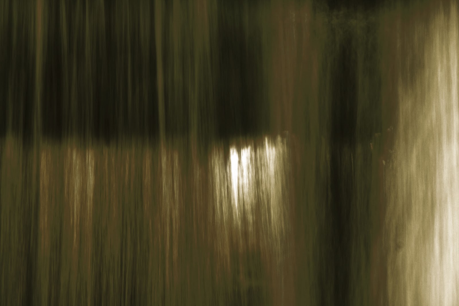
from the Chamber series
These are digital photo images from a series I have thought of as Chamber. I've been photographing this area in Lambertville, NJ, in daylight and at night, through the seasons, over several years. I never come away without seeing something new, something surprising, both during the time I spend there shooting, and when I finally get to look at the images on my computer.
Shot underneath a bridge and capturing a spill-over designed to carry water from the Delaware & Raritan Canal underneath the Canal into the Delaware River. The word Chamber suggested itself to me almost immediately, with its sense of an enclosed space beyond the effluence.
If the water is low enough, I can get close to the water falling over the spill-over. During late summer, I have to get brave and push through weeds that grow way over my head in height and are host to way too many spiderwebs and cobwebs, not to mention whatever flying insects are hanging around. On a muggy summer evening I will often come away from spending time there damp with mist from the spray and from the humidity. Because of the mist, the air thick with humidity and distinctive river scent that disappears during the winter months, summer nights are my favorite time to be there.


Saturday, January 15, 2011
pink
 | |||
paint color names from art supply websites
These days I often find it difficult to determine the origin of an idea. The vast amount of data and stimuli encountered on any given day defies measure and sometimes even specific cognitive register. Middle-aged memory doesn't help, either. This is a somewhat long-winded way of saying that I can't remember how I was moved to paint a pink painting. I can tell you that the idea for this post came after a Facebook post in which I said that I had just painted a big pink painting and an ensuing email conversation with buddy Hylla Evans. When I then announced I would name the painting Maybelline, Hylla responded with her by saying that she would name her new chicken after my new pink painting. I am honored!
From Hylla:
She is a six month old blue color Cochin bantam. No doubt each of her feathers has been carefully lined in dark gray with an eye makeup pencil. Her comb and wattles are the most perfect Maybelline pink, too. Such a beauty!
 |
| Maybelline |
Pink, or I should say, the pinks, do not typically dominate my painting, living, or sartorial palettes. Nonetheless, I created Maybelline, as one of my final paintings of 2010. Out with a bang, so to speak.
Associations and baggage are endless for pink: politics, gender, sex, sex, sex; race (anyone remember Crayola's Flesh crayon? Thought that was outmoded? Well, guess again how many major paint manufacturers still label a pink-toned paint Flesh), age, status, wellness...the list goes on and on.
For a wildly comprehensive reference on all things pink, see wikipedia here and here...
Perhaps because I am interested in the more esoteric aspects of the usage of the word pink--and I see this entry as somewhat transgressive--this is my favorite dictionary definition of pink (From Douglas Harper's Online Etymology Dictionary...a fabulous resource.)pink (v.) c.1300, "pierce, stab, make holes in," perhaps from a Romanic stem *pinc- (cf. Fr. piquer, Sp. picar), from L. pungere "to pierce, prick" (see pungent). Surviving mainly in pinking shears.
. . . . . . . . . . . . . . . . . . . . . . . . . . . . . . . . . . . . . . . . . . . . . . . . .
OK...back to art...and a few words from paint maker, artist, teacher, and chicken trainer, Hylla Evans, who waxes on about one of her favorite pinks:
 Deep, Rich, Warm - Pink!
As winter cold settles in, the best remedy is a morning spent making Studio Pink Paint Sticks. Each pink is unique and each has its following, but Studio Pink with its understated name is my favorite.
Since Studio Pink is a single pigment paint color (there is no white in it), it can be translucent and oh-so-warm without being cloyingly sweet the way Candy Pink is. Studio Pink works and plays well with others. It's the perfect opposite of Cadmium Green Light in every way.

Many painters find reds are challenging because they always seem to move to the middle ground. Try putting a red in your background and watch it move forward just enough to irritate you. Reds do that; they move visually. Want red in the foreground? Better add some orange or yellow or it runs right back to the middle. Damn frustrating color! Pinks do the same thing, so it's important to make a choice of warm vs cool pink or the painting will control the artist rather than the other way 'round. Try putting a single pigment pink next to a warm metallic such as Copper and you could go dizzy from the tango they do together!
A n d n o w, o n w i t h t h e (p i n k) s h o w ...
Curatorial note: The images below all come from the Call For Pink. I decided to limit the post to images that the artists who responded to the call, rather than mining the web. I also placed the images somewhat randomly, that is, after endlessly arranging and rearranging them. Thanks to all who contributed.

Morning Scape
Encaustic on board 8 x 8" 2010
Encaustic on board 8 x 8" 2010
Though I don't usually use pink in my paintings,
I've started putting down under-colors of wax to
start a painting off -- this one started out solid pink.

Baby's Breath Encaustic on Panel
I did this painting earlier this year. I was thinking of pale skin at first.
The way the dots of color layered I imagined them as particles of something
disbursing into the air. For some reason the title Baby's Breath stuck in my mind
with this one. I also thought of the soft, delicate nature of a baby's skin.

Broadway 44 16 x 16 oil on canvas
Pink, pink, pink-- it is a color with so much baggage!
...I steadfastly avoided it for years and years, until I was invited to participate in a breast cancer fundraiser (of course, all donated work had to be primarily pink). After overcoming the initial yuk factor, I was determined to find ways to become comfortable with the color.

Eleanor Farrell
Cherry Blossoms
Usually pink is not my color of choice for graphic design (or anything else except maybe cosmos), but here's a photo I took in San Francisco's Japantown a few years ago during the Cherry Blossom Festival. I added a pink frame to reflect the color of the blossoms.

Herringbone (Sansom Pink)
Photographic Assemblage
A rare sighting of pink in the urban landscape
(window glass splashed with pink paint)
(window glass splashed with pink paint)
was the inspiration for this photographic assemblage.

Snubbie
2010 acrylic on canvas 42 x 44"

Hot Topic
acrylic on linen


I get pink here and there.

Art Critic

Pink Veil I


Pink magically works as a great buffer when you need to
take the hard edge off of something.
take the hard edge off of something.

My image is a digital collage of two encaustic monotypes.
Actual works are 40" x 26".
Pink is the center of our body.
Pink is the center of our body.

An ongoing project I have is randomly drawing a paint chip from a
local manufacturer's fan deck and drawing the name of the color.
One hundred and one of them can be found here.

Ian MacLeod
Untitled #31
19.5" x 16.75" (irregular)
Acrylic, latex, tape, sticker and varathane on cardboard
As I worked on this piece it seemed it needed some colour --
Untitled #31
19.5" x 16.75" (irregular)
Acrylic, latex, tape, sticker and varathane on cardboard
As I worked on this piece it seemed it needed some colour --
the pink acrylic paint was right there and on it went.
 |
| Big Pink |

This painting with a pink ground is so new, it is still titled "Pink Ground"
.....acrylic on canvas, 48 x 48"
It was fun playing with an unfamiliar color.

Koan Box Pink/Salmon/Green, 2008-10
oil, wax, alkyd, and 23 kt gold on wood cigar box
10.5 x 8.25 x 2"
oil, wax, alkyd, and 23 kt gold on wood cigar box
10.5 x 8.25 x 2"
The Koan Boxes are an ongoing exploration of paint, color, intuition, paradox and randomness; they all start either as drop clothes on the floor of the studio or as palettes, for months or even years, until they let me know when they are ready to make the leap to the wall, wherein I investigate, elaborate or simplify what is happening on each.

I always try to make Pink "mean" because when it appears in
nature it seems natural and beautiful but using it on the canvas
without appearing corny
nature it seems natural and beautiful but using it on the canvas
without appearing corny
is a huge challenge, and I love a challenge.

Peel (from The Paradise Project)
2009 16 x 16 x 2" acrylic on panel
In this painting and others in The Paradise Project,
I used vernacular color –- hot, saturated Caribbean hues --
I used vernacular color –- hot, saturated Caribbean hues --
to evoke an emotional reaction to place and time.

White Shiny Orbit
8 x 8 x 2”
acrylic paint, acetate, masonite, pine, gel medium
I don't know what it is about pink but...Pink Love seems to be in the air.
8 x 8 x 2”
acrylic paint, acetate, masonite, pine, gel medium
I don't know what it is about pink but...Pink Love seems to be in the air.
I've had several conversations with folks about how pink is on their mind.
Could it be a need for softness? Wombness? Or Girliness? I'm not sure.
Could it be a need for softness? Wombness? Or Girliness? I'm not sure.

Julie Alexander
Locunia
Oil on Canvas 24 x 24" 2010
Here is a mostly pink painting. I love the color pink.
It gets my juices flowing on so many levels.
This time it's muddied pink -- skin or bandaid -- rubbed
over a scratched, landscape-ish ground.
Locunia
Oil on Canvas 24 x 24" 2010
Here is a mostly pink painting. I love the color pink.
It gets my juices flowing on so many levels.
This time it's muddied pink -- skin or bandaid -- rubbed
over a scratched, landscape-ish ground.

Matter of Fact
12 x 16" Lithograph

Here's my new pink piece called Pink Lady.
She's 42 x 40"
Paper, cardboard, book parts and tacks
with encaustic on three joined panels

Blink 2010 acrylic on paper 22 x 22" |

| Chris Neyen Pink 2 oil and oil pastel on paper/bristol board |

Pink 3
oil and oil pastel on paper/bristol board

Randy Carone
Pink Hats/Hello Kitty
photograph 2010
Pink 2
I wanted to give color and new life to the sepia toned photo of
this little girl from long ago so I chose pink,
symbolic for me of free-spirited transformation.

Dreaming the Pink Dress 2
Pink: a girl color, not for redheads,
makes other colors sing, sunrise, sunset, gaudy, garish,
and the name of a flat bottomed, narrow-sterned sailing vessel with bulging sides.

This is "Rues" from my 20/20 series
The series shared a commonality of size, collage as structure and water media applied, in this instance watered down red reads PINK. Other drawing media also applied.
Pink usually has an unsettling effect but i have been told that this piece is calming
as you travel the streets of paris, you are not irate and seeing red...its a more voluptuous pink, and pleasure for the eye.

Silk Road 86
2007 encaustic on panel 12 x 12"

Silk Road 147
2010, encaustic on panel 16 x 16"
courtesy of Arden Gallery, Boston
Pink has no particular significance for me save for the fact that it's a color, and I work with color, so I try to work with as broad a spectrum as possible; also, my color is created with layers of transparent or translucent paint, so the hue is mutable, depending on the angle of the light and your position in relation to the light and the painting.

2003 oil, mixed media on canvas 36 x 36"
Wow--no pink in my last 20 years...hmmmm except maybe this one?
I remember working on this piece thinking was it too pink or too fleshy?

Encaustic 9 x 12"
The title is Tillow, meaning to put forth new shoots. I gave it that title after I made it as my thoughts were that the color pink means a positive new start for me.

Sea
oil on canvas, 40 x 30"
oil on canvas, 40 x 30"
I love using a pink shade in paint,
although I sometimes end up painting it out.
although I sometimes end up painting it out.

Tremain Smith
Universal Harmony
2010 Acrylic, collage, watercolor & pencil on paper 30" x 22"
My mother once told me to paint pink for health -
what could be healthier than Universal Harmony?
and...my pink....

Maybelline
36 x 48" oil and alkyd on canvas 2010
This is too corporeal for my delicate sensibilities.
In fact, it may become incorporeal,
In fact, it may become incorporeal,
with only a digital record remaining....
f i n i
Subscribe to:
Posts (Atom)